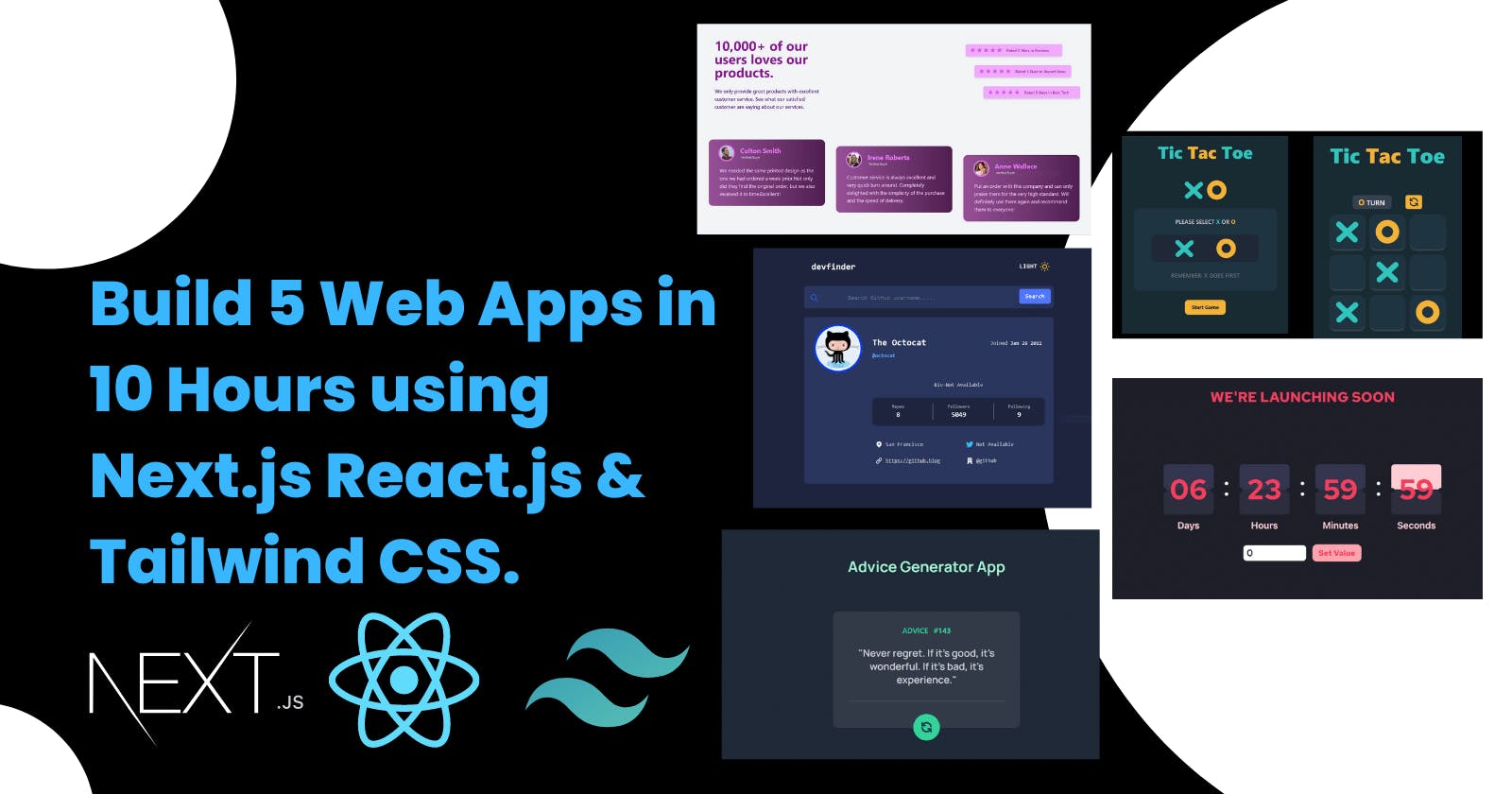
Build 5 Web Apps in 10 Hours using Next.js, React.js & Tailwind CSS.


Hello everyone, I hope you all are doing well. This Post is a part of Epic Hashnode Writeathon! .
In this post tutorial, I will show you how you can build 5 Web Apps in 10 Hours. All of the web apps are part of the Frontend Mentor challenge projects and our goal is to make it look like the design given by the Frontend Mentor.
Here are the links to all the FrontendMentor challenges that we will build.
So without any further talk, Let's start building it 🚀.
But before starting building the Apps ,I want to you see the Quick Demo of all the projects that we are going to build.
So that you all will be pumped up to build these projects.
I ahve explained , each and everything and I will also share the Github Repo of all the projects if you just want the code.
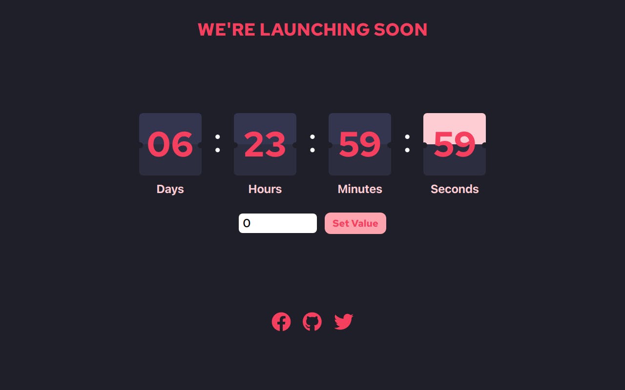
Demo Link - Launch Countdown Timer
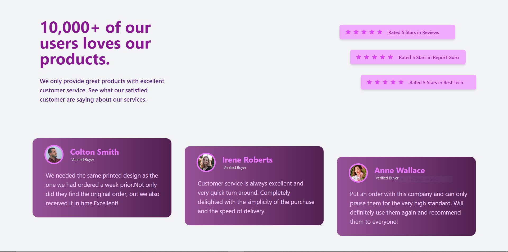
Demo Link - Social Proof Section
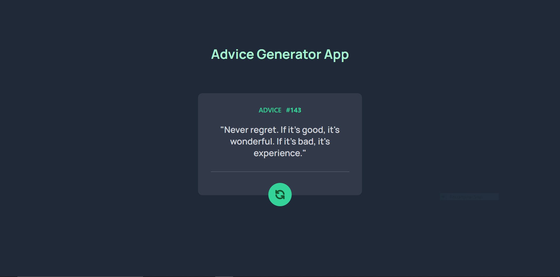
Demo Link - Advice Genearotor App
Demo Link - Github User Search App
Tech Stack Used
- React.js
- Next.js
- Tailwind CSS
- TypeScript
- JavaScript
What will you learn by building these 5 Web Apps
- How to get started with Next.js.
- How to integrate Tailwind CSS in a Next.js Application.
- How to use Tailwind CSS to style your apps.
- How to add custom fonts and animation in Tailwind CSS.
- How to use Typescript and add types ,interfaces in Next.js app.
We are using TypeScript in this Project, so we have to explicitly define all the props, constants & function data types.
Now we will start building the apps one by one.
Launch Countdown Timer
Step-1 Initializing the Project
Create a new next-js app with Tailwind CSS bootstrapped in it.
You can use this one-line command to create a new nextjs app with TypeScript and Tailwind CSS.
npx create-next-app -e with-tailwindcss my-project-name
You can name your project whatever you want, I will name it as launch-countdown- timer.
Now after creating the project open it in Vs Code or any IDE that you prefer.
Find the index.tsx file inside pages directory. and delete everything and paste the given code below.
import type { NextPage } from 'next'
import Head from 'next/head'

const Home: NextPage = () => {

return (
    <div className="flex min-h-screen flex-col items-center bg-[#1e1f29]">
      <Head>
        <title>Launch Countdown Timer</title>
        <link rel="icon" href="/favicon.ico" />
      </Head>


)}

export default Home;
After that visit the globals.css file inside the styles folder and import a google font link (Red Hat Font) at the top of the file inside it.
@import url('https://fonts.googleapis.com/css2?family=Inter:wght@400;600;700;800;900&family=Red+Hat+Text:wght@500;700&display=swap');


@tailwind base;
@tailwind components;
@tailwind utilities;
After that go to the tailwindcss.config.js file and we will add some custom font and animation that we will use later in the project.
module.exports = {
  content: [
    './pages/**/*.{js,ts,jsx,tsx}',
    './components/**/*.{js,ts,jsx,tsx}',
  ],
  theme: {
    extend: {
      animation: {
        flip:'flip 1s cubic-bezier(0, 0, 0.2, 1) infinite'
      },
      keyframes:{
        flip: {
          'from': { transform:'rotateX(0deg)', transformOrigin: '50% bottom ',},
          'to':{transform:  'rotateX(180deg)', transformOrigin: '50% bottom ',}
        }
      }
    },
       fontFamily: {
      'redhat':['Red Hat Text', 'sans-serif'],
      },
  plugins: [],
}

}
So, that was all for the first step, Now moving to the second step.
Step-2 Creating the Components
Now, it is time to create some components that we are going to use in the app.
Create a new folder name components in the root of the directory and create 5 files inside it.
- Header.tsx
- Footer.tsx
- NumberBox.tsx
- TimerContainer.tsx
- TimerInput.tsx
After creating the file we will start adding the code to each file one by one.
Inside Header.tsx
import React from 'react'

interface msgProps {
  message: string,
};

export const Header = ({ message }: msgProps) => {
  return (
    <header className="mx-auto mt-2">
      <h1 className="text-2xl mt-8 md:text-4xl font-bold font-redhat text-rose-500 font-bold text-center mx-auto ">
        {message ? message : "WE'RE LAUNCHING SOON"}
      </h1>
    </header>
  )
Inside Footer.tsx
import React from 'react'

export const Footer = () => {
  return (
    <div className="mx-auto w-full ">
      <div className=" w-full flex mt-10 md:mt-40 space-x-6 justify-center items-center ">
        <a href="https://facebook.com/raivikas200" target="_blank">
          <svg xmlns="http://www.w3.org/2000/svg" viewBox="0 0 512 512" className="h-7 w-7 md:h-10 md:w-10 hover:cursor-pointer" fill="rgb(244 63 94)">
            <path d="M504 256C504 119 393 8 256 8S8 119 8 256c0 123.78 90.69 226.38 209.25 245V327.69h-63V256h63v-54.64c0-62.15 37-96.48 93.67-96.48 27.14 0 55.52 4.84 55.52 4.84v61h-31.28c-30.8 0-40.41 19.12-40.41 38.73V256h68.78l-11 71.69h-57.78V501C413.31 482.38 504 379.78 504 256z" />
          </svg>
        </a>
        <a href="https://github.com/raiv200" target="_blank">
          <svg xmlns="http://www.w3.org/2000/svg" viewBox="0 0 512 512" className="h-7 w-7 md:h-10 md:w-10 hover:cursor-pointer" fill="rgb(244 63 94)">
            <path d="M165.9 397.4c0 2-2.3 3.6-5.2 3.6-3.3.3-5.6-1.3-5.6-3.6 0-2 2.3-3.6 5.2-3.6 3-.3 5.6 1.3 5.6 3.6zm-31.1-4.5c-.7 2 1.3 4.3 4.3 4.9 2.6 1 5.6 0 6.2-2s-1.3-4.3-4.3-5.2c-2.6-.7-5.5.3-6.2 2.3zm44.2-1.7c-2.9.7-4.9 2.6-4.6 4.9.3 2 2.9 3.3 5.9 2.6 2.9-.7 4.9-2.6 4.6-4.6-.3-1.9-3-3.2-5.9-2.9zM244.8 8C106.1 8 0 113.3 0 252c0 110.9 69.8 205.8 169.5 239.2 12.8 2.3 17.3-5.6 17.3-12.1 0-6.2-.3-40.4-.3-61.4 0 0-70 15-84.7-29.8 0 0-11.4-29.1-27.8-36.6 0 0-22.9-15.7 1.6-15.4 0 0 24.9 2 38.6 25.8 21.9 38.6 58.6 27.5 72.9 20.9 2.3-16 8.8-27.1 16-33.7-55.9-6.2-112.3-14.3-112.3-110.5 0-27.5 7.6-41.3 23.6-58.9-2.6-6.5-11.1-33.3 2.6-67.9 20.9-6.5 69 27 69 27 20-5.6 41.5-8.5 62.8-8.5s42.8 2.9 62.8 8.5c0 0 48.1-33.6 69-27 13.7 34.7 5.2 61.4 2.6 67.9 16 17.7 25.8 31.5 25.8 58.9 0 96.5-58.9 104.2-114.8 110.5 9.2 7.9 17 22.9 17 46.4 0 33.7-.3 75.4-.3 83.6 0 6.5 4.6 14.4 17.3 12.1C428.2 457.8 496 362.9 496 252 496 113.3 383.5 8 244.8 8zM97.2 352.9c-1.3 1-1 3.3.7 5.2 1.6 1.6 3.9 2.3 5.2 1 1.3-1 1-3.3-.7-5.2-1.6-1.6-3.9-2.3-5.2-1zm-10.8-8.1c-.7 1.3.3 2.9 2.3 3.9 1.6 1 3.6.7 4.3-.7.7-1.3-.3-2.9-2.3-3.9-2-.6-3.6-.3-4.3.7zm32.4 35.6c-1.6 1.3-1 4.3 1.3 6.2 2.3 2.3 5.2 2.6 6.5 1 1.3-1.3.7-4.3-1.3-6.2-2.2-2.3-5.2-2.6-6.5-1zm-11.4-14.7c-1.6 1-1.6 3.6 0 5.9 1.6 2.3 4.3 3.3 5.6 2.3 1.6-1.3 1.6-3.9 0-6.2-1.4-2.3-4-3.3-5.6-2z" />
          </svg>
        </a>

        <a href="https://twitter.com/raivikas200" target="_blank">
          <svg xmlns="http://www.w3.org/2000/svg" viewBox="0 0 512 512" className="h-7 w-7 md:h-10 md:w-10 hover:cursor-pointer" fill="rgb(244 63 94) ">
            <path d="M459.37 151.716c.325 4.548.325 9.097.325 13.645 0 138.72-105.583 298.558-298.558 298.558-59.452 0-114.68-17.219-161.137-47.106 8.447.974 16.568 1.299 25.34 1.299 49.055 0 94.213-16.568 130.274-44.832-46.132-.975-84.792-31.188-98.112-72.772 6.498.974 12.995 1.624 19.818 1.624 9.421 0 18.843-1.3 27.614-3.573-48.081-9.747-84.143-51.98-84.143-102.985v-1.299c13.969 7.797 30.214 12.67 47.431 13.319-28.264-18.843-46.781-51.005-46.781-87.391 0-19.492 5.197-37.36 14.294-52.954 51.655 63.675 129.3 105.258 216.365 109.807-1.624-7.797-2.599-15.918-2.599-24.04 0-57.828 46.782-104.934 104.934-104.934 30.213 0 57.502 12.67 76.67 33.137 23.715-4.548 46.456-13.32 66.599-25.34-7.798 24.366-24.366 44.833-46.132 57.827 21.117-2.273 41.584-8.122 60.426-16.243-14.292 20.791-32.161 39.308-52.628 54.253z" />
          </svg>
        </a>
      </div>
    </div>
  )
}
Inside NumberBox.tsx
import React from 'react'

interface numProp {
    num: string | number,
    unit: string,
    flip: boolean,
};

export const NumberBox = ({ num, unit, flip }: numProp) => {
    return (
        <div className="flex flex-col items-center mt-4 px-2">
            <div className=" relative bg-transparent flex flex-col items-center justify-center rounded-lg w-32 h-32  text-2xl md:text-4xl mt-4 ">
                <div className="rounded-t-lg rounded-b-lg bg-[#343650] w-full h-full"></div>

                <div className="text-5xl absolute text-rose-500 z-10 font-bold font-redhat md:text-7xl font-mono ">
                    {num}
                </div>

                <div className=" rounded-b-lg rounded-t-lg bg-[#2c2e3f] w-full h-full"></div>

                <div className={`absolute  w-full h-1/2 top-0  rounded-t-lg z-5 ${flip ? 'animate-flip bg-rose-200' : 'bg-transparent'}`}></div>
                {/* Two Small Dots */}
                <div className="absolute -right-1 top-[60px] rounded-full w-[12px] h-[12px] bg-[#1e1f29]"></div>
                <div className="absolute -left-1 top-[60px] rounded-full w-[12px] h-[12px] bg-[#1e1f29]" ></div>

            </div>
            <p className="text-lg mt-3 font-semibold text-rose-200  md:text-2xl ">
                {unit}
            </p>
        </div>
    )
}
Inside TimerContainer.tsx
import React from 'react'
import { NumberBox } from './NumberBox'

interface timeProps{
  days: number | string,
  hours:number | string ,
  minutes:number | string,
  seconds:number | string,
}

export const TimerContainer = ({days, hours, minutes ,seconds }: timeProps) => {

  let daysFlip = false;
  let hoursFlip = false;
  let minutesFlip = false;
  let secondsFlip = true;

 if (seconds <=0 && minutes <=0 && hours <=0 && days <=0){
   daysFlip =  false;
   hoursFlip =  false;
   minutesFlip = false;
   secondsFlip = false;
 }

 if(seconds == 0){
   if( minutes !=0){
    seconds=59;
   }

   secondsFlip = false;
   minutesFlip = true;
 }
 if (minutes == 0 ){
    if( hours !=0){
      minutes=59;
    }

   minutesFlip = false;
   hoursFlip = true;
 }

 if( hours == 0){
   hoursFlip = false;
   if(days !=0){
     daysFlip = true;
   }

 }


   if(days <10){
     days="0"+days
   }

   if(hours <10){
     hours="0"+hours
   }

   if(minutes <10){
     minutes="0"+minutes
   }

   if(seconds < 10){
     seconds="0"+seconds

   }

    return (

     <div className=" mt-2 md:mt-20  rounded-xl">
       <div className="grid grid-cols-2 gap-4 py-6 px-10 md:flex md:items-center md:justify-between md:mt-2  rounded-xl md:px-6 md:py-8 ">
            <NumberBox num={days } unit="Days" flip={daysFlip} />
            <span className=" hidden text-5xl -mt-8 md:inline-block md:text-7xl font-normal text-gray-50 ">:</span>
            <NumberBox num={hours } unit="Hours" flip={hoursFlip} />
            <span className="hidden text-5xl -mt-8 md:inline-block md:text-7xl font-normal text-gray-50 ">:</span>
            <NumberBox num={minutes} unit="Minutes" flip={minutesFlip}/>
            <span className="hidden text-5xl -mt-8 md:inline-block md:text-7xl font-normal text-gray-50 ">:</span>
            <NumberBox num={seconds} unit="Seconds" flip={secondsFlip} />
        </div>

      </div>
    )
}
Inside TimerInput.tsx
import React from 'react'


interface inputProps {
    value:number,
    handleClick() : void,
    handleChange(e:any) : void,
}

export const TimerInput = ({value , handleClick ,handleChange}: inputProps) => {
  return (
    <div className="z-6 mx-auto space-y-4 flex flex-col md:flex-row justify-center items-center md:space-y-0">
        <input
        className="text-xl md:text-2xl font-redhat outline-none px-2 py-1 w-40 rounded-lg mr-4 "
        name="Timer Input"
        type="number"
        placeholder="Enter No. of Days"
        value={value}
        onChange={handleChange}
        min={0}
        />

      <button onClick={handleClick} className="bg-rose-300 text-xl font-semibold font-redhat px-4 py-2 md:text-xl rounded-xl text-rose-500 hover:bg-rose-500 hover:text-rose-100 transition duration-300 ease-in"> Set Value</button>
    </div>
  )
}
After creating the components and adding the above code, Import all the components inside the index.tsx file.
You will notice that you are getting some errors in the files that the props you are using are not defined.
It is because of TypeScript since it is a strongly typed language, each and everything has to be defined.
But don't worry as soon as we complete the code the error will go.
The index.tsx file will look like this now:
import type { NextPage } from 'next'
import Head from 'next/head'
import { TimerContainer } from '../components/TimerContainer'
import { Footer } from '../components/Footer'
import { Header } from '../components/Header'
import { TimerInput } from '../components/TimerInput'

const Home: NextPage = () => {

return (

<div className="flex min-h-screen flex-col items-center bg-[#1e1f29]">
      <Head>
        <title>Launch Countdown Timer</title>
        <link rel="icon" href="/favicon.ico" />

      </Head>

      <Header message={message} />

      <TimerContainer
        days={days}
        hours={hours}
        minutes={minutes}
        seconds={seconds}
      />
      <TimerInput value={newTime} handleClick={handleClick} handleChange={handleChange} />

      <Footer />
    </div>

)}

export default Home;
As you can see, I am passing various props to the components.
Now, in the next step, we are going to create some variables using the useState Hook and write the logic of the timer.
Step-3 Code Logic for the Countdown Timer
Open the index.tsx file and inside the Home component create some variable.
And after that, we will add the code logic for the countdown timer inside Home Component above the return statement.
Inside Home Component (index.tsx):
  const [newTime, setNewTime] = useState<number>(0)
  const [days, setDays] = useState<number>(0);
  const [hours, setHours] = useState<number>(0);
  const [minutes, setMinutes] = useState<number>(0);
  const [seconds, setSeconds] = useState<number>(0);
  const [message, setMessage] = useState<string>("");

 const timeToDays = time * 60 * 60 * 24 * 1000;

 let countDownDate = new Date().getTime() + timeToDays;
Now below the above code, we will use the setInterval function inside the useEffect hook, which will update the time every second.
useEffect(() => {


    var updateTime = setInterval(() => {
      var now = new Date().getTime();

      var difference = countDownDate - now;

      var newDays = Math.floor(difference / (1000 * 60 * 60 * 24));
      var newHours = Math.floor((difference % (1000 * 60 * 60 * 24)) / (1000 * 60 * 60));
      var newMinutes = Math.floor((difference % (1000 * 60 * 60)) / (1000 * 60));
      var newSeconds = Math.floor((difference % (1000 * 60)) / 1000);

      setDays(newDays);
      setHours(newHours);
      setMinutes(newMinutes);
      setSeconds(newSeconds);


      if (difference <= 0) {
        clearInterval(updateTime);
        setMessage("The Launch Has Started");
        setDays(0);
        setHours(0);
        setMinutes(0);
        setSeconds(0);
      }
    })

    return () => {
      clearInterval(updateTime);
    }

  }, [time]);
As you can see we have also used the clearInterval() function which will clear or stop the setInerval() function as soon as the countdown time reaches zero.
The step-3 is done but two more things are remaining.
We have to create two functions handleClick() and handleChange() function which will be used to set the countdown timer as per the user-entered input.
Step-4 Creating the two functions handleClick() & handlechange()
After the end of the useEffect function, create two functions below it handleChange() and handleClick() like this:
const handleClick = () => {

    setTime(newTime);
    console.log(time);
    setNewTime(0);
  };

  const handleChange = (e: any) => {
    let inputTime = e.target.value;
    setNewTime(inputTime);

  };
Now for the final step, we will add the flip animation.
Step-5 Adding the Flip Animation
The flip animation will be added conditionally, I have already added the code for the animation in advance inside the TimerContainer.tsx and the NumberBox.tsx components in Step-2.
You can take a look at the code and try to understand it on your own as a challenge.
It's not that difficult to understand the conditional logic that I have used to conditionally show the Flips.
Congratulations 🎉 🥳 !!!
Everything is done and you have successfully created awesome projects.
Now open the terminal inside VS code and start the development server by running the npm run dev command.
And visit localhost:3000 and your application is ready.
So that was all for the Launch Countdown Timer App.
Social Proof Section
Step-1 Create the starting project
Create a new next-js app with Tailwind CSS bootstrapped in it.
You can use this one-line command to create a new Next.js app with TypeScript and Tailwind CSS.
npx create-next-app -e with-tailwindcss my-project-name
You can name your project whatever you want, I will name it as social-proof-section.
Now after creating the project open it in Vs Code or any IDE that you prefer.
Find the index.tsx file inside pages directory and delete everything and paste the given code below.
import type { NextPage } from 'next'
import Head from 'next/head'

const Home: NextPage = () => {

return (
    <div className="flex min-h-screen flex-col items-center bg-[#1e1f29]">
      <Head>
        <title>Social Proof Section</title>
        <link rel="icon" href="/favicon.ico" />
      </Head>
)}

export default Home;
After that move to the second step.
Step-2 Creating the Components
Now, it is time to create some components that we are going to use in the app.
If you visit the FrontendMentor challenge link for this project, you will see that there are three different types of components Heading Text, Start Rating, and the Testimonial Card.
Create a new folder name components in the root of the directory, and create 5 files inside it.
- HeaderText.tsx
- Star.tsx
- StarRating.tsx
- TestimonialCard.tsx
- Testimonials.tsx
After creating the file we will start adding the code to each file one by one.
The HeaderText.tsx Component
This component consists of an H1 tag and a P tag which are placed inside a Div tag.
import React from 'react'

const SUB_TEXT="We only provide great products with excellent customer service.   See what our satisfied customer are saying about our services.";

const HEAD_TEXT="10,000+ of our users loves our products.";


export const HeaderText = () => {
  return (
    <div className="group flex flex-col w-3/4 md:w-1/3 space-y-6 md:space-y-8 px-6 py-6 rounded-lg justify-start mt-6">
      <h1 className="text-3xl md:w-[360px]  md:text-5xl text-fuchsia-800 font-bold">{HEAD_TEXT}</h1>
      <p className="text-md md:text-lg text-purple-900 font-medium">{SUB_TEXT}</p>
    </div>
  )
}
The Star.tsx Component
This component consists of an SVG of a Star which will be used inside the StarRating.tsx Component.
import React from 'react'

export const Star = () => {
    return (

<svg xmlns="http://www.w3.org/2000/svg" className=" h-5 w-5 text-fuchsia-500 group-hover:text-fuchsia-100" viewBox="0 0 20 20" fill="currentColor">
                <path d="M9.049 2.927c.3-.921 1.603-.921 1.902 0l1.07 3.292a1 1 0 00.95.69h3.462c.969 0 1.371 1.24.588 1.81l-2.8 2.034a1 1 0 00-.364 1.118l1.07 3.292c.3.921-.755 1.688-1.54 1.118l-2.8-2.034a1 1 0 00-1.175 0l-2.8 2.034c-.784.57-1.838-.197-1.539-1.118l1.07-3.292a1 1 0 00-.364-1.118L2.98 8.72c-.783-.57-.38-1.81.588-1.81h3.461a1 1 0 00.951-.69l1.07-3.292z" />
 </svg>

    )
}
The StarRating.tsx Component
It consists of 5 Star.tsx Component and a P tag which is placed inside a Div Tag and is made to be in Flex-row direction.
import React from 'react'
import { Star } from './Star'

interface Prop{
  text:string,
}

export const StarRating = ({text} :Prop) => {
  return (
    <div className="w-[260px] md:w-[350px] group flex flex-col space-y-2 py-2 md:flex-row items-center md:justify-start md:space-y-0 md:space-x-4 my-4 px-4  md:py-3 bg-fuchsia-300 rounded-md cursor-pointer  hover:bg-fuchsia-500 transition duration-300 ease-in shadow-md hover:shadow-xl md:even:ml-16 md:last:ml-32">
        <div className="flex space-x-1">
           <Star />
           <Star />
           <Star />
           <Star />
           <Star />
        </div>
        <p className="text-sm flex justify-start items-center md:text-md font-semibold text-fuchsia-700 group-hover:text-fuchsia-200 ">{text}</p>
    </div>
  )
}
The TestimonialCard.tsx Component
It consists of an Image Tag, H2 Tag, P tag, and Div Tag, It is a simple Card Component with some good design and hover animations.
import Image from 'next/image'
import React from 'react'

interface TesimonialProps {
  customerName: string,
  testimonialText: string,
  imageURL: string,
}

export const TestimonialCard = ({ customerName, testimonialText, imageURL }: TesimonialProps) => {
  return (
    <div className={`group w-3/4 md:w-[420px]  md:h-[240px] flex flex-col items-start md:space-x-4 bg-gradient-to-r from-[#975297] to-[#502050] mt-4 md:even:mt-16 md:last:mt-32 px-6 py-6 rounded-2xl cursor-pointer hover:shadow-md hover:bg-gradient-to-r hover:from-[#ce74ff] hover:to-[#743c8a] transition duration-1000 ease-in-out `}>
      <div className="flex space-x-5 pb-4  md:space-x-6 md:px-4 ">
        <div className="w-[50px] h-[50px] rounded-full ring-4 ring-fuchsia-400 group-hover:ring-fuchsia-100">

          <Image
            src={imageURL}
            objectFit="contain"
            width={50}
            height={50}
            className="rounded-full"
          />
        </div>

        <div className=" flex flex-col items-start justify-start">
          <h2 className="text-md md:text-2xl font-bold text-fuchsia-400 group-hover:text-fuchsia-100 ">{customerName}</h2>
          <p className="text-xs md:text-md font-extralight text-gray-100 ml-1 group-hover:text-fuchsia-50">Verified Buyer</p>
        </div>

      </div>

      <div className="text-md md:text-lg text-fuchsia-200 font-500 py-2">
        {testimonialText}
      </div>
    </div>
  )
}
The background of the Card is a gradient background.
The Testimonials.tsx Component
It consists of 3 TestimonialCard.tsx Components which are placed inside a Div Tag in the Flex-row direction.
import React from 'react'
import { TestimonialCard } from './TestimonialCard'

const TESTIMONIAL_DATA = [

    {
        customerName: "Colton Smith",
        imageURL: "/image-colton.jpg",
        testimonialText: "We needed the same printed design as the one we had ordered a week prior.Not only did they find the original order, but we also received it in time.Excellent!",

    },

    {
        customerName: "Irene Roberts",
        imageURL: "/image-irene.jpg",
        testimonialText: "Customer service is always excellent and very quick turn around. Completely delighted with the simplicity of the purchase and the speed of delivery.",

    },

    {
        customerName: "Anne Wallace",
        imageURL: "/image-anne.jpg",
        testimonialText: "Put an order with this company and can only praise them for the very high standard. Will definitely use them again and recommend them to everyone!",

    },


];

export const Testimonials = () => {
    return (
        <div className="flex flex-col md:flex-row justify-center items-center gap-10">
            {
                TESTIMONIAL_DATA.map((item) => {
                    return <TestimonialCard customerName={item.customerName} imageURL={item.imageURL} testimonialText={item.testimonialText} />
                })

            }
        </div>
    )
}
The main challenge here is as you can see in the FrontendMentor challenge design, the StarRating.tsx and TestimonialCard.tsx component are shifted.
In the Case of StarRating.tsx Component, the 2nd and 3rd have some Left Margin and in the case of the TestimonialCard.tsx Component, they have some Top Margin.
So to achieve these design we have to add two special classes even:ml-16 and last:ml-32 in StarRating.tsx Component and even:mt-16 and last:mt-32 in TestimonialCard.tsx Component.
What these two classes are doing is that every even position children element inside the div or a section will have a margin-top or margin-left equal to 16px, and every last child inside the div or a section will have a margin-top or margin-left equal to 32px.
Step-3 Import the Components
Now it's time to import the component that we have created inside the index.tsx file inside the Pages folder.
Inside Index.tsx Page
import type { NextPage } from 'next'
import Head from 'next/head'
import { HeaderText } from '../components/HeaderText';
import { StarRating } from '../components/StarRating'
import { Testimonials } from '../components/Testimonials';

const Home: NextPage = () => {
  return (
    <div className="flex min-h-screen background  flex-col bg-gray-100 items-center ">
      <Head>
        <title>Social Proof Section</title>
        <link rel="icon" href="/favicon.ico" />
      </Head>


       <div className="flex flex-col md:flex-row items-center justify-between mx-a px-4 md:px-24 py-2 ">
        <HeaderText />
        <div className="flex flex-col justify-center items-center">
          <StarRating text="Rated 5 Stars in Reviews" />
          <StarRating text="Rated 5 Stars in Report Guru" />
          <StarRating text="Rated 5 Stars in Best Tech" />
        </div>
      </div>
      <Testimonials />

    </div>
  )
}

export default Home
Everything is done and you have successfully created awesome projects.
Now open the terminal inside VS code and start the development server by running the npm run dev command.
And visit localhost:3000 and your application is ready.
So that was all for the Social Proof Section App.
Advice Generator App
Step-1 Initializing the Project
Create a new next-js app with Tailwind CSS bootstrapped in it.
You can use this one-line command to create a new nextjs app with TypeScript and Tailwind CSS.
npx create-next-app -e with-tailwindcss my-project-name
You can name your project whatever you want, I will name it an Advice Generator App.
Now after creating the project open it in Vs Code or any IDE that you prefer.
Find the index.tsx file inside pages directory. and delete everything and paste the given code below.
import type { NextPage } from 'next'
import Head from 'next/head'

const API="https://api.adviceslip.com/advice";

const Home: NextPage = () => {

return (
    <div className="flex min-h-screen flex-col items-center bg-[#1e1f29]">
      <Head>
        <title>Advice Generator App</title>
        <link rel="icon" href="/favicon.ico" />
      </Head>


)}

export default Home;
In this project we are using Manrope font, so for that, we need to import this font from google fonts.
And for the API part, we are going to use Advice Slip API, which is a free API.
As you can see in the above code we have added a constant name API with the value of the API link
After that visit the globals.css file inside the styles folder and import a google font link (Manrope Font) at the top of the file inside it.
@import url('https://fonts.googleapis.com/css2?family=Manrope:wght@600;700&display=swap');


@tailwind base;
@tailwind components;
@tailwind utilities;
So, now to use the font inside our app, we need to add it as a custom font inside the tailwindcss.config.js file.
module.exports = {
  content: [
    './pages/**/*.{js,ts,jsx,tsx}',
    './components/**/*.{js,ts,jsx,tsx}',
  ],
  theme: {
    extend: {
      fontFamily:{
        manrope:["Manrope"],
      }
    },
  },
  plugins: [],
}
Step-2 Creating the Components
If you see the design given by the Frontend Mentor Challenge, there are only two components that you can make.
- AdviceCard.tsx
- CircularButton.tsx
So, now create the components folder inside your project folder and create two files with the names AdviceCard.tsx and CircularButton.tsx .
First, we will create the CircularButton component and then theAdviceCard component.
Inside CircularButton.tsx
import React from 'react'

interface Prop {
    handleAdvice():void,
}

export const CircularButton = ({handleAdvice} : Prop) => {
    return (
        <button onClick={handleAdvice} className=" bg-emerald-400 px-4 py-4 rounded-full text-green-900 hover:bg-green-200 hover:text-emerald-500  hover:shadow-xl hover:shadow-emerald-600 hover:scale-105 transition duration-300 ease-in">
            <svg xmlns="http://www.w3.org/2000/svg" className="h-8 w-8" fill="none" viewBox="0 0 24 24" stroke="currentColor" strokeWidth="3">
                <path strokeLinecap="round" strokeLinejoin="round" d="M4 4v5h.582m15.356 2A8.001 8.001 0 004.582 9m0 0H9m11 11v-5h-.581m0 0a8.003 8.003 0 01-15.357-2m15.357 2H15" />
            </svg>
        </button>
    )
}
In the above code as you can see we have added a prop handleAdvice, which is a function that will fetch new Advice data every time the button gets clicked.
Inside AdviceCard.tsx
import React from 'react'
import { CircularButton } from './CircularButton';

interface TextProps {
    id: number,
    adviceText: string,
    handleAdvice(): void,
}

export const AdviceCard = ({ adviceText, id , handleAdvice }: TextProps) => {
    return (
        <div className="relative w-[380px] md:w-[450px] md:h-[280px] bg-[#323a49] mt-20 px-8 pt-8 pb-16  rounded-xl flex flex-col justify-center items-center ">
            <p className="text-md md:text-lg uppercase font-medium  text-emerald-400 absolute top-8 mx-auto ">
                Advice
                {"  "}
                <span className=" font-bold  ml-2 ">
                    #{id}
                </span>
            </p>
            <div className="text-lg md:text-2xl font-manrope font-semibold text-gray-300 leading-8 text-center mt-4">
                "{adviceText}"
            </div>
            <hr className="w-[380px] border-t-1  border-gray-500 mt-8 absolute bottom-16 mx-auto" />
            <div className="absolute -bottom-[30px] mx-auto ">
            <CircularButton handleAdvice={handleAdvice} />
            </div>
        </div>
    )
}
In this component also we are passing three props as you can see.
The three props are:
- advice text
- id
- handleAdvice
Now we have made both the components, it's time to code the logic for fetching the API and displaying the data that we will get from it.
Step-3 Fetching the API
So basically, the API returns a single object which contains two fields the id and the adviceText field.
Now, visit the index.js file inside the Pages folder and create two constants with the useState hook inside the Home function, and set their default values as given below.
const [adviceText ,setAdviceText] =useState<string>("Never regret.
  If it's good, it's wonderful. If it's bad, it's experience.");

const [adviceId, setAdviceId] = useState<number>(143);
And also don't forget to import useState from the react library.
Now after that create an arrow function with the name fetchAdvice() and inside it fetch the API using the inbuilt fetch() function and store the result inside the constant name data.
After that set the two pieces of the state with the value coming from the API and also create a function name handleAdvice() and call the fetchAdvice() inside it.
const [adviceText ,setAdviceText] =useState<string>("Never regret.
If it's good, it's wonderful. If it's bad, it's experience.");
  const [adviceId, setAdviceId] = useState<number>(143);

  const fetchAdvice = async () => {

      const res = await fetch(API);
      const data= await res.json();

      setAdviceId(data.slip.id);
      setAdviceText(data.slip.advice);
    };


  const handleAdvice= () => {
    fetchAdvice();
  };
Step-4 Import the components and pass the Props
At last, import the two components from the components folder and add those inside the Home function.
After all that the index.tsx will look something like this:
Inside index.tsx
import type { NextPage  } from 'next'
import Head from 'next/head'
import { useState } from 'react';
import { AdviceCard } from '../components/AdviceCard'


const API="https://api.adviceslip.com/advice";

const Home: NextPage= () => {

  const [adviceText ,setAdviceText] =useState<string>("Never regret. If it's good, it's wonderful. If it's bad, it's experience.");
  const [adviceId, setAdviceId] = useState<number>(143);

  const fetchAdvice = async () => {

      const res = await fetch(API);
      const data= await res.json();

      setAdviceId(data.slip.id);
      setAdviceText(data.slip.advice);
    };


  const handleAdvice= () => {
    fetchAdvice();
  };

  return (
    <div className="flex min-h-screen bg-gray-800 flex-col items-center py-2">
      <Head>
        <title>Advice Generator App</title>
        <link rel="icon" href="/favicon.ico" />
      </Head>

      <h1 className="text-emerald-200 font-bold text-2xl md:text-4xl font-manrope mt-4 rounded-xl hover:rounded-xl hover:shadow-lg hover:shadow-emerald-600 hover:bg-emerald-500 hover:text-emerald-100 px-4 py-2 transition duration-300 ease-in ">
        Advice Generator App
        </h1>
      {/* <CircularButton /> */}
      <AdviceCard id={adviceId} adviceText={adviceText}  handleAdvice={handleAdvice} />
    </div>
  )
}

export default Home
Everything is done and you have successfully created awesome projects.
Now open the terminal inside VS code and start the development server by running the npm run dev command.
And visit localhost:3000 and your application is ready.
So that was all for the Advice Generator App.
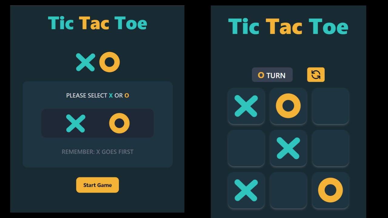
Tic Tac Toe Game App
Step-1 Initializing the Project
Create a new next-js app with Tailwind CSS bootstrapped in it.
You can use this one-line command to create a new nextjs app with TypeScript and Tailwind CSS.
npx create-next-app -e with-tailwindcss my-project-name
Now after creating the project open it in Vs Code or any IDE that you prefer.
Find the index.tsx file inside pages directory. and delete everything and paste the given code below.
import type { NextPage } from 'next'
import Head from 'next/head'

const Home: NextPage = () => {

return (
    <div className="flex min-h-screen flex-col items-center bg-[#1e1f29]">
      <Head>
        <title>Tic-Tac-Toe Game</title>
        <link rel="icon" href="/favicon.ico" />
      </Head>


)}

export default Home;
I have created some custom classes as we are going to use the same utility classes, again and again, it's better to create a custom class inside the globals.css file which is inside the styles folder.
After that visit the globals.css file inside the styles folder add the custom classes as given below.
@tailwind base;
@tailwind components;
@tailwind utilities;

@layer utilities {

 .button{
     @apply flex items-center justify-center text-lg font-bold text-gray-900 transition duration-300 ease-in ;
 }
  .square {
    @apply flex h-[90px] w-[90px] md:h-[100px] md:w-[100px] items-center justify-center bg-[#1f3540] rounded-2xl shadow-md active:scale-125 transition duration-200 ease-in hover:bg-[#18272e] shadow-gray-400/30 ;
  }

  .board {
    @apply mt-24 flex h-[350px] w-[350px] md:mt-20 md:h-[400px] md:w-[400px] flex-col items-center justify-center space-y-4 rounded-xl;
  }

  .board-row {
    @apply flex items-center justify-center space-x-4;
  }
}
Step-2 Creating the Components
If you see the design given by the Frontend Mentor Challenge, there are only many components that you can make or divide your app into.
But I am going to divide it into 5 components.
- XIcon.tsx
- OIcon.tsx
- ChoosePlayer.tsx
- Board.tsx
- WinnerModal.tsx
So, now create the components folder inside your project and create two files with the names XIcon.tsx, OIcon.tsx,ChoosePlayer.tsx, Board.tsx and WinnerModal.tsx.
We are using TypeScript in this Project, so we have to explicitly define all the props, constants & function data types.
First, we will create the XIcon and the OIcon component.
Inside XIcon.tsx
import React from 'react'

export const XIcon = () => {
  return (
    <div className="relative h-16 w-16 cursor-pointer ">
      <div className=" absolute origin-top-left rotate-[44deg] ml-2 -mt-[1px] bg-[#30c4bd]  h-4 w-20 rounded-l-full rounded-r-full ">
      </div>
      <div className="absolute origin-top-right -rotate-[42deg] -ml-[23px] bg-[#30c4bd]  h-4 w-20  rounded-l-full rounded-r-full ">
      </div>
    </div>
  )
}
In the above code as you can see I have created a custom X-Icon using two divs placed inside another div.
I have positioned the inner two divs absolute and also added rotation (using transform rotate) to tilt the divs, to make the "X " icon.
You can also use an SVG Icon or a PNG image if it's available to you.I was not able to find any suitable SVG Icon for this, so that's why I created this Icon on my own using HTML and TailwindCSS.
Inside OIcon.tsx
import React from 'react'

export const OIcon = () => {
    return (
        <div className="flex items-center justify-center h-16 w-16 cursor-pointer ">
            <div className=" h-8 w-8 ring-[18px] ring-[#f3b236] rounded-full">
            </div>
        </div >
    )
}
In the above code as you can see I have created a custom O-Icon using One div placed inside another div and using some CSS.
Inside ChoosePlayer.tsx
import React from 'react'
import { OIcon } from './OIcon'
import { XIcon } from './XIcon'


interface PlayerProp {
  handlePlayerX(): void,
  handlePlayerO(): void,
  handleNewGame(): void,
}

export const ChoosePlayer = ({handlePlayerX, handleNewGame, handlePlayerO }: PlayerProp) => {


  return (
    <div className="mt-20 md:mt-16 w-[500px] flex flex-col items-center justofy-center mx-auto">
      <div className="flex rounded-xl px-6 py-2 items-center justify-center space-x-4">
      <XIcon />
      <OIcon />
      </div>
      <div className="flex flex-col items-center py-8 w-[400px] md:w-[500px] h-64 md:h-72 rounded-2xl bg-[#1f3540] mt-6 space-y-6 md:space-y-8">
        <p className="text-md text-gray-300 uppercase font-semibold  md:text-xl ">
          Please Select
          {"  "}
          <span className="text-[#30c4bd] text-xl font-bold ">X</span>
          {"  "}
          or
          {"  "}
          <span className="text-[#f3b236] text-xl font-bold">O</span>
        </p>
        <div className="w-3/4 bg-gray-800  flex items-center justify-evenly h-24 rounded-2xl p-6 ">
          <button onClick={handlePlayerX} className="focus:bg-gray-300 hover:bg-[#bcfefb] trasnsition duartion-300 ease-in flex items-center justify-center rounded-xl px-6 py-2 ">
            <XIcon />
          </button>
          <button onClick={handlePlayerO} className="focus:bg-gray-300 hover:bg-[#ffe1a9] trasnsition duartion-300 ease-in flex items-center justify-center rounded-xl px-6 py-2 " >
            <OIcon />
          </button>
        </div>
        <p className="text-md text-gray-500 uppercase font-semibold  md:text-xl "> Remember: X goes first</p>
      </div>
      <button onClick={handleNewGame} className="button hover:ring-4 hover:ring-cyan-300 rounded-xl mt-8 px-6 py-3 bg-[#f3b236] hover:bg-[#30c4bd]">
        Start Game
      </button>
    </div>
  )
}
In this component, what we will do here is that we have to create two buttons having Values "X" and "O".
So to provide the user that which icon the user wants to play with and then we have another button, whose function is to start the game based on the user's choice.
If the user chooses "X", then the first player will use the "X" mark else it will use the "O" mark.
If the user doesn't choose any one of the icons, then the default icon will be the "X" mark, which means "X" goes first by default, until and unless the user selects "O" from the given choices.
As you can see in the above code, we are passing three props and all of them are functions.
- handlePlayerX()
- handlePlayerO()
- handleNewGame()
We will discuss the work of this function in step-3.
Inside Board.tsx
import React from 'react'
import { OIcon } from './OIcon'
import { XIcon } from './XIcon'

interface PlayerProp {
  winner:string,
  playerX: boolean,
  squares: Array<any>,
  handlePlayer(i: number): void,
  handleRestartGame(): void,
}

interface SquareProp {
  value: JSX.Element | string | null,
  onClick(): void,
}

export const Board = ({ winner, playerX, handlePlayer, handleRestartGame, squares }: PlayerProp) => {

  // Square Button and RenderSquare function
  function Square({ value, onClick }: SquareProp) {
    return (
      <button className="square" onClick={onClick} disabled={winner ? true :false} >
        {value}
      </button>
    )

  }

  function value(i:number){
     let value;
     if( squares[i] ==="X"){
       value=<XIcon />
     }else if( squares[i] === "O"){
        value=<OIcon />
     }else{
        value=null;
     }

     return value;

  }

  const renderSquare = (i: number) => {
    return <Square value={value(i)} onClick={() => handlePlayer(i)} />
  }


  return (
    <div>
      <div className="board">
        <div className=" w-[300px] md:[w-400px] rounded-lg flex items-center justify-center space-x-10">
          <div>
            {playerX
              ?
              <div className="text-white bg-gray-700 text-xl px-4 py-1 w-28 rounded-lg font-medium uppercase">
                <span className="text-[#30c4bd] text-2xl font-bold">
                  X
                </span>
                {" "}
                Turn
              </div>

              :
              <div className="text-white bg-gray-700 text-xl px-4 py-1 w-28 rounded-lg font-medium  uppercase">
                <span className=" text-[#f3b236] text-2xl  font-bold">
                  O
                </span>
                {" "}
                Turn
              </div>

            }

          </div>
          <button onClick={handleRestartGame} className="group button px-2 py-1 hover:ring-4 hover:ring-cyan-300 rounded-md bg-[#f3b236] hover:bg-[#30c4bd]" >
            <svg xmlns="http://www.w3.org/2000/svg" className="h-8 w-8 group-hover:rotate-180 transition duration-300 eas-in  " fill="none" viewBox="0 0 24 24" stroke="currentColor" strokeWidth="2">
              <path strokeLinecap="round" strokeLinejoin="round" d="M4 4v5h.582m15.356 2A8.001 8.001 0 004.582 9m0 0H9m11 11v-5h-.581m0 0a8.003 8.003 0 01-15.357-2m15.357 2H15" />
            </svg>
          </button>
        </div>
        <div className="board-row">
          {renderSquare(0)}
          {renderSquare(1)}
          {renderSquare(2)}
        </div>

        <div className="board-row">
          {renderSquare(3)}
          {renderSquare(4)}
          {renderSquare(5)}
        </div>

        <div className="board-row">
          {renderSquare(6)}
          {renderSquare(7)}
          {renderSquare(8)}
        </div>
      </div>
    </div>
  )
}
In this component, we will create the board for the game on which the user will play the game.
Here, the main aim is to style the board nicely using the Tailwind CSS, and along with that, we have two more things.
The first is an indicator div which tells the user whose turn is next to play (whether is "X" turns or "O" turns to play) and the other is also a button that can be used to clear/refresh the board to play the new game.
As you can see in the above code, we are passing five props.
- winner
- playerX
- squares
- handlePlayer()
- handleRestartGame()
We will discuss the work of the props and function in step-3.
Inside WinnerModal.tsx
In this component, we will create a modal, which will be displayed when the user won.
import React from 'react'
import { OIcon } from './OIcon';
import { XIcon } from './XIcon'

interface GameProps{
  winner:string
  handleQuitGame():void;
  handleNewGame():void;
}

export const WinnerModal = ({winner ,handleQuitGame , handleNewGame} :GameProps) => {
  return (
    <div className="bg-gray-900/90 z-10 min-h-screen w-full absolute top-0 left-0">
      <div className="w-[500px] h-[250px] rounded-xl bg-[#1f3540] space-y-10 px-6 py-4 mx-auto mt-52 flex items-center justify-center flex-col">
       <h2 className="flex flex-col items-center justify-center space-y-6 text-2xl md:text-4xl font-bold">
         {winner === "X" ? <XIcon /> : <OIcon />}
         <p className="uppercase text-[#30c4bd]">Takes the Round</p>
       </h2>

      <div className="flex items-center justify-center space-x-16">
        <button onClick={handleQuitGame} className="button px-4 rounded-md py-1 bg-[#a8bdc8] hover:bg-[#718087] hover:ring-4 hover:ring-gray-400">Quit</button>
        <button onClick={handleNewGame} className="button px-4 rounded-md py-1 bg-[#f3b236] hover:bg-[#30c4bd] hover:ring-4 hover:ring-cyan-300">Next Round</button>
      </div>
      </div>
    </div>
  )
}
Note: I have not added a modal for the Draw case. if you wish you can add it on your own as a challenge.
It's quite simple, you just have to create a DrawModal.tsx and display it if there is no winner, or else what you can do is create a prop as text which you will pass through the winner modal and the display the text inside the modal conditionally if there is a winner or not.
So these are the two ways you can do it. I want to give this as a challenge to you. As you can see in the above code, we are passing three props.
- winner
- handleNewGame()
- handleQuitGame()
We will discuss the work of the props and function in step-3.
Step-3 Writing the Logic for the Game
After creating the components we will import them inside the index.tsx file in the Home Component.
But before that, we have to write the logic for our game.
Now, inside the Home component, we will first create three constants using the useState hook and a variable name winner, which will hold the value of the function calculate inner() which we will create later.
const [isX, setIsX] = useState<boolean>(true);
const [newGame, setNewGame] = useState<boolean>(false);
const [squares, setSqaures] = useState<Array<any>>(Array(9).fill(null));

let winner = calculateWinner(squares);

Now we will create the calculateWinner() function.

// Calculate the winner
  function calculateWinner(squares: Array<any>) {
    // Total 8 winning patterens
    const winningPatterns = [
      [0, 1, 2],
      [3, 4, 5],
      [6, 7, 8],
      [0, 3, 6],
      [1, 4, 7],
      [2, 5, 8],
      [0, 4, 8],
      [2, 4, 6]
    ];

    for (let i = 0; i < winningPatterns.length; i++) {
      const [a, b, c] = winningPatterns[i];

      if (squares[a] && squares[a] === squares[b] && squares[a] === squares[c]) {
        return squares[a];
      }
    }
    return null;
  }
In this function what we have done here is that first, we created an array name winningPatterns which contains all the possible winning combinations.
After that, we used for loop and then looped over the array winningPatterns and then inside that we checked for the condition that if the squares (containing the value either "X" or "O" ) at that given index is equal to the value that we clicked on the board.
If the condition is true, then we return the value that is inside the square at that given index.
If the condition is false then we return null.
Now, we will create six more functions, that we will have passed into the various component as props that we have created in step-2.
// handle Choose player
  function handlePlayerX() {
    setIsX(true);
  }

  function handlePlayerO() {
    setIsX(false);

  }

 //// It will Handle which Icon will appear on Board on clicking  one of the Squares
  function handlePlayer(i: number) {

    if (calculateWinner(squares) || squares[i]) {
      return;
    }

    squares[i] = isX ? "X" : "O";
    setSqaures(squares);
    setIsX(!isX);
  }

  // It will handle the Restart of the Game

  function handleRestartGame() {
    setIsX(true);
    setSqaures(Array(9).fill(null));
  }

  // It will handle the start Game when the player choose one of the Icon
  // with which they want to player
  function handleNewGame() {
    setIsX(true);
    setSqaures(Array(9).fill(null));
    setNewGame(true);
  };
At last, we have finished writing the logic and creating the functions.
It's quite a long project, and writing it as a blog post was quite a time taking task.
All is left now to import all the components inside the index.tsx file and the project will be completed.
Step-4 Importing all the Components
Now, it is, time to import all the components inside the Home component, which is inside the index.tsx file.
Inside index.tsx
import type { NextPage } from 'next';
import Head from 'next/head';
import React, { useState } from 'react';
import { Board } from '../components/Board';
import { ChoosePlayer } from '../components/ChoosePlayer';
import { WinnerModal } from '../components/WinnerModal';


const Home: NextPage = () => {

  const [isX, setIsX] = useState<boolean>(true);
  const [newGame, setNewGame] = useState<boolean>(false);
  const [squares, setSqaures] = useState<Array<any>>(Array(9).fill(null));

  let winner = calculateWinner(squares);


  // handle Choose player
  function handlePlayerX() {
    setIsX(true);
  }

  function handlePlayerO() {
    setIsX(false);

  }

  //// It will Handle which Icon will apppear on Board on cliking  one the Squares
  function handlePlayer(i: number) {

    if (calculateWinner(squares) || squares[i]) {
      return;
    }

    squares[i] = isX ? "X" : "O";
    setSqaures(squares);
    setIsX(!isX);
  }

  // It will handle the Restart of the Game

  function handleRestartGame() {
    setIsX(true);
    setSqaures(Array(9).fill(null));
  }


  // It will handle the start Game when the player choose one of the Icon
  // with which they want to player
  function handleNewGame() {
    setIsX(true);
    setSqaures(Array(9).fill(null));
    setNewGame(true);
  };

  function handleQuitGame() {
    setIsX(true);
    setSqaures(Array(9).fill(null));
    setNewGame(false);
  }
  // Calculate the winner
  function calculateWinner(squares: Array<any>) {
    // Total 8 winning patterens
    const winningPatterns = [
      [0, 1, 2],
      [3, 4, 5],
      [6, 7, 8],
      [0, 3, 6],
      [1, 4, 7],
      [2, 5, 8],
      [0, 4, 8],
      [2, 4, 6]
    ];

    for (let i = 0; i < winningPatterns.length; i++) {
      const [a, b, c] = winningPatterns[i];

      if (squares[a] && squares[a] === squares[b] && squares[a] === squares[c]) {
        return squares[a];
      }
    }
    return null;
  }

  return (
    <div className="flex min-h-screen bg-[#192a32] flex-col items-center  py-2">
      <Head>
        <title>Tic-Tic-Toe Game</title>
        <link rel="icon" href="/favicon.ico" />
      </Head>

      <h1 className="text-4xl md:text-6xl font-extrabold mt-4 text-[#30c4bd] ">
        Tic
        {" "}
        <span className="text-[#f3b236]">Tac </span>
        {" "}
        Toe
      </h1>

      {!newGame
        ?
        <ChoosePlayer
          handleNewGame={handleNewGame}
          handlePlayerX={handlePlayerX}
          handlePlayerO={handlePlayerO}
        />
        :
        <Board
          winner={winner}
          playerX={isX}
          squares={squares}
          handlePlayer={handlePlayer}
          handleRestartGame={handleRestartGame}
        />
      }
      {winner &&
      <WinnerModal
          winner={winner}
          handleQuitGame={handleQuitGame}
          handleNewGame={handleNewGame}
        />
      }
    </div>
  )
}

export default Home
The XIcon.tsx and the OIcon.tsx components will be imported inside the other three components, not inside the Home component.
The rest three components, ChoosePlayer.tsx , Board.tsx, and WinningModal.tsx will be imported and all the required props are needed to pass through them.
At last, we have finished the project 🎉🎉.
Now open the terminal inside the VsCode ad run the command npm run dev to start the development server and you will then see the application running on localhost:3000.
So that was all for the Tic Tac Toe Game App.
Github User Search App

Step-1 Initializing the Project
Create a new next-js app with Tailwind CSS bootstrapped in it.
You can use this one-line command to create a new nextjs app with TypeScript and Tailwind CSS.
But in this particular project , I have not used Typescript , so if you want to add Typescript you can add it on your own.
npx create-next-app -e with-tailwindcss my-project-name
You can name your project whatever you want, I will name it as github-user-finder-app.
Now after creating the project open it in Vs Code or any IDE that you prefer.
Find the index.tsx file inside pages directory. and delete everything and paste the given code below.
import Head from 'next/head'

const Home = () => {

return (
    <div className="flex min-h-screen flex-col items-center bg-[#1e1f29]">
      <Head>
        <title>Github User Finder App</title>
        <link rel="icon" href="/favicon.ico" />
      </Head>


)}

export default Home;
We also need to add two more npm packages for this project.
Install the necessary npm packages:
- Install @heroicons/react
- Install next-themes
npm install next-themes @heroicons/react
Step-2 To Create the Components and add the dark mode Functionality
First of all, create a components folder in the root of the directory and add these files:
- Avatar.js
- Loading.js
- Logo.js
- Navbar.js
- GithubUser.js
- SearchBar.js
- UserBio.js
- UserData.js
- UserProfile.js
- UserStats.js
Don,t get worried by seeing so many components, I have purposely created these components so that it will be easy for you to manage code.
One important point before that, open the _app.js file inside the pages directory and add the following code:
Inside _app.js :
import 'tailwindcss/tailwind.css'
import '../styles/globals.css'
import { ThemeProvider } from 'next-themes'

function MyApp({ Component, pageProps }) {
  return (
    <ThemeProvider attribute="class">
      <Component {...pageProps} />
    </ThemeProvider>
  )
}

export default MyApp
Then open the tailwind.config.js file and add the darkMode Key with the value of class like this:
Inside tailwind.config.js :
module.exports = {
  content: [
    './pages/**/*.{js,ts,jsx,tsx}',
    './components/**/*.{js,ts,jsx,tsx}',
  ],
  theme: {
    extend: {
      animation: {
        wiggle: 'wiggle 1s ease-in-out ',
        wiggle_reverse:'wiggle_reverse 0.3s ease-in'
      },

      keyframes: {
        wiggle: {
          '0%, 100%': { transform: 'rotate(-60deg)' },
          '50%': { transform: 'rotate(60deg)' },
        },
        wiggle_reverse:{
          '0%': { transform: 'rotate(90deg)' },
          '100%': { transform: 'rotate(0deg)' },
        }
      }
    },
  },
  darkMode:"class",
  plugins: [],
}
and then next.config.js file and add the domains for the images like this:
Inside next.config.js :
/** @type {import('next').NextConfig} */
module.exports = {
  images: {
    domains:["nextjsdev.com","avatars.githubusercontent.com"]
},
  reactStrictMode: true,
}

I have added two custom animations also which  I am using in this application.

Now paste this code one by one in each component:

**Inside Avatar.js:**

```jsx
import Image from "next/image";
import Vercel from "../public/vercel.svg"
const Avatar = ({imageURL}) => {
  return (
    <div className=" w-[120px] h-[120px] ml-8 ring-[5px] ring-[#3b52d4] dark:ring-[#053bff] rounded-full ">
    {imageURL ? (
      <Image
        src={imageURL ? imageURL : Vercel}
        width="120"
        height="120"
        objectFit="cover"
        className="rounded-full "
    />
    ): (
      <p className="text-lg font-bold font-mono text-center pt-8 text-gray-800 dark:text-gray-200">No Image Found</p>
    )

    }
    </div>
  )
}

export default Avatar
Inside Loading.js:
export const Loading = () => {
  return (
    <div className=" w-28  mx-auto mt-40">
     <svg className="animate-spin -ml-1 mr-3 h-10 w-10 text-blue-500" xmlns="http://www.w3.org/2000/svg" fill="none" viewBox="0 0 24 24">
        <circle className="opacity-25" cx="12" cy="12" r="10" stroke="currentColor" strokeWidth="4"></circle>
        <path className="opacity-75" fill="currentColor" d="M4 12a8 8 0 018-8V0C5.373 0 0 5.373 0 12h4zm2 5.291A7.962 7.962 0 014 12H0c0 3.042 1.135 5.824 3 7.938l3-2.647z"></path>
      </svg>
    </div>
  )
}
Inside Logo.js:
import Link from 'next/link'

const Logo = () => {
  return (
    <Link href="/">
      <div className="p-3 rounded-xl cursor-pointer">
        <p className="font-mono text-xl font-semibold text-gray-800 dark:text-gray-50 md:text-xl lg:text-2xl">
          devfinder
        </p>
      </div>
    </Link>
  )
}

export default Logo
Inside Navbar.js:
import { SunIcon } from '@heroicons/react/outline'
import { MoonIcon } from '@heroicons/react/solid'
import Logo from './Logo'
import { useTheme } from 'next-themes'
import { useState, useEffect } from 'react'

const Navbar = () => {
  const { systemTheme, theme, setTheme } = useTheme();

  const [mounted, setMounted] = useState(false);

  useEffect(() => {
    setMounted(true);
  }, [])

  const renderThemeChanger = () => {
    const currentTheme = theme === 'system' ? systemTheme : theme
    if (!mounted) return null;

    if (currentTheme === 'dark') {
      return (
        <div className="flex  cursor-pointer items-center ">
          <h2 className="text-md font-mono font-semibold uppercase tracking-wider dark:text-gray-50">
            Light
            <SunIcon
              className="ml-1 inline-block h-8  w-8 text-amber-400 animate-wiggle  "
              onClick={() => setTheme('light')}
            />
          </h2>
        </div>
      )
    } else {
      return (
        <div className="flex  cursor-pointer items-center">
          <h2 className="text-md font-mono  font-semibold uppercase tracking-wider text-slate-500 ">
            Dark
            <MoonIcon
              className="ml-1 inline-block h-8  w-8 text-gray-600 animate-wiggle_reverse"
              onClick={() => setTheme('dark')}
            />
          </h2>
        </div>
      )
    }
  }

  return (
    <header className="align-items mx-auto mt-4 flex max-w-md justify-between space-x-4 rounded-md p-2 md:max-w-2xl">
      <div>
        <Logo />
      </div>

      {renderThemeChanger()}
    </header>
  )
}

export default Navbar
Inside GithubUser.js:
import UserProfile from './UserProfile'
import UserBio from './UserBio'
import UserStats from './UserStats'
import UserData from './UserData'

const GithubUser = (props) => {
  const date = new Date(props.data.created_at)
  const newDate = date.toDateString(4, 10).slice(4, 15)

  return (
    <div className="mx-auto mt-6 flex max-w-md min-h-[470px] flex-col items-end justify-between  space-y-4 rounded-lg bg-gray-200 py-6 transition duration-300 ease-in dark:bg-[#2b365e] md:min-h-fit md:max-w-2xl">
       <UserProfile
        name={props.data.name}
        date={newDate}
        username={props.data.login}
        imageURL={props.data.avatar_url}
      />

      <div className=" flex w-full md:max-w-lg flex-col space-y-6 px-6 py-3">
        <UserBio bio={props.data.bio} />
        <UserStats
          repos={props.data.public_repos}
          followers={props.data.followers}
          following={props.data.following}
        />

        <UserData
          location={props.data.location}
          twitterUsername={props.data.twitter_username}
          blog={props.data.blog}
          company={props.data.company}
        />
      </div>
    </div>
  )
}

export default GithubUser
Inside SearchBar.js:
import { SearchIcon } from '@heroicons/react/outline'


const SearchBar = ({userName, handleClick , userRef}) => {

  return (
    <div className=" align-items mx-auto mt-4 flex max-w-md justify-between space-x-2 rounded-lg bg-gray-200 p-2 pb-2 transition duration-300 ease-in dark:bg-[#2b365e] md:max-w-2xl">
      <SearchIcon  className="mt-3 ml-2 h-6 w-6 text-[#5176ff] dark:text-blue-600" />
      <input
        name="search"
        ref={userRef}
        placeholder="Search GitHub username....."
        className="text-md mt-1 w-[400px] rounded-md bg-gray-200 px-2 py-2 font-mono leading-6 text-slate-500 placeholder-neutral-400 transition  duration-300 ease-in focus:outline-none dark:bg-[#2b365e] dark:text-gray-50 dark:placeholder-slate-500"
      />
      <button
        onClick={handleClick}
        className=" text-md mx-auto h-10 rounded-md bg-gray-50 px-4 font-mono font-medium text-blue-600 shadow-xl transition duration-300 ease-in hover:bg-blue-500 hover:text-blue-100 dark:bg-[#5176ff] dark:text-white dark:hover:bg-blue-600 "
      >
        Search
      </button>
    </div>
  )
}

export default SearchBar
Inside UserBio.js:
import React from 'react'

const UserBio = ({bio}) => {
  return (
    <p className="font-mono text-sm font-medium text-gray-800 dark:text-gray-300 text-center ">
          Bio-{bio === null ? 'Not Available' :bio}
    </p>
  )
}

export default UserBio
Inside UserData.js:
import {
    LocationMarkerIcon,
    LinkIcon,
    OfficeBuildingIcon,
  } from '@heroicons/react/solid'

const UserData = ({location, twitterUsername,blog, company}) => {
  return (
    <div className="grid grid-cols-1 gap-6 px-2 py-4 md:grid-cols-2 md:gap-x-10">
          <div className="flex items-center  space-x-2 font-semibold text-white transition-colors duration-150 hover:text-blue-400">
            <LocationMarkerIcon className="h-5 w-5 text-slate-500  dark:text-gray-100" />
            <p className="font-mono text-sm font-medium text-gray-900 dark:text-gray-300">
              {location ? location : "Not Available"}
            </p>
          </div>

          <div className="flex items-center space-x-2 font-semibold text-white transition-colors duration-150 hover:text-blue-400">
            <svg
              width="20"
              height="20"
              fill="currentColor"
              className="text-sky-400 opacity-100"
            >
              <path d="M6.29 18.251c7.547 0 11.675-6.253 11.675-11.675 0-.178 0-.355-.012-.53A8.348 8.348 0 0020 3.92a8.19 8.19 0 01-2.357.646 4.118 4.118 0 001.804-2.27 8.224 8.224 0 01-2.605.996 4.107 4.107 0 00-6.993 3.743 11.65 11.65 0 01-8.457-4.287 4.106 4.106 0 001.27 5.477A4.073 4.073 0 01.8 7.713v.052a4.105 4.105 0 003.292 4.022 4.095 4.095 0 01-1.853.07 4.108 4.108 0 003.834 2.85A8.233 8.233 0 010 16.407a11.616 11.616 0 006.29 1.84"></path>
            </svg>
            <p className="font-mono text-sm font-medium text-gray-900 dark:text-gray-300">
              <a
                href={`https://twitter.com/${twitterUsername}`}
                target="_blank"
              >
                {twitterUsername ? twitterUsername : "Not Available"}
              </a>
            </p>
          </div>

          <div className="flex items-center  space-x-2 font-semibold text-white transition-colors duration-150 hover:text-blue-400">
            <LinkIcon className="h-5 w-5 text-slate-500 dark:text-gray-100 " />
            <p className="decoration-3 font-sm font-mono text-sm font-medium text-gray-900 underline dark:text-gray-300">
              <a href={`https://${blog}`} target="_blank">
                {blog ? blog :"Not Available"}
              </a>
            </p>
          </div>

          <div className="flex items-center  space-x-2 font-semibold text-white transition-colors duration-150 hover:text-blue-400">
            <OfficeBuildingIcon className="h-5 w-5 text-slate-500 dark:text-gray-100 " />
            <p className="font-sm font-mono text-sm font-medium text-gray-900 dark:text-gray-300">
              {company ? company : "Not Available"}
            </p>
          </div>
        </div>
  )
}

export default UserData
Inside UserProfile.js:
import Avatar from './Avatar'

const UserProfile = ({ name, date, username ,imageURL}) => {
  return (
    <div className=" flex w-full items-center space-x-4  md:justify-evenly md:space-x-6">
      <Avatar imageURL={imageURL} />
      <div className="flex flex-1 items-center space-x-6 px-2 md:flex-1 md:items-start md:justify-between">
        <h2 className="w-32 md:w-44 font-mono text-lg font-bold text-gray-800 dark:text-gray-50 md:text-2xl">
          {name}{' '}
          <span className="inline-block font-mono text-sm text-blue-400">
            {username && `@${username ? username :'Not Available'}`}
          </span>
        </h2>
        {username && <p className=" md:text-md -mt-2 pl-6 font-mono text-sm font-[400] text-slate-600 dark:text-gray-300 md:mt-0 md:p-6 md:pt-2">
          Joined{' '}
          <span className="flex font-mono text-xs font-semibold md:inline-block md:text-sm">
            {date ? date :"Not Available"}
          </span>
        </p>}
      </div>
    </div>
  )
}

export default UserProfile
Inside UserStats.js:
import React from 'react'

const UserStats = ({repos,followers ,following}) => {
  return (
    <div className=" grid grid-cols-3 gap-6  divide-x divide-gray-700 rounded-xl bg-gray-50 py-4 dark:divide-gray-50 dark:bg-[#1e253f]">
    <div className="align-items flex flex-col px-4 text-center">
      <h4 className="font-mono text-xs font-semibold text-gray-700 dark:text-gray-400 ">
        Repos
      </h4>
      <p className="font-mono text-lg font-extrabold text-gray-700 dark:text-gray-50 ">
        {repos ? repos :"Not Available"}
      </p>
    </div>

    <div className="align-items flex flex-col text-center">
      <h4 className="font-mono text-xs font-semibold text-gray-700 dark:text-gray-400 ">
        Followers
      </h4>
      <p className="font-mono text-lg font-extrabold text-gray-700 dark:text-gray-50 ">
        {followers ? followers :"Not Available"}
      </p>
    </div>

    <div className="align-items flex flex-col text-center">
      <h4 className="font-mono text-xs font-semibold text-gray-700 dark:text-gray-400 ">
        Following
      </h4>
      <p className="font-mono text-lg font-extrabold text-gray-700 dark:text-gray-50 ">
        {following? following : "Not Available"}
      </p>
    </div>
  </div>
  )
}

export default UserStats
Now open up the terminal and start the application by running the command
npm run dev
The application might be working or it may be showing some error because we haven't completed the application yet, so don't worry about it.
Step-3 To fetch the Github API and Display the data
Now the final step has come, go to index.js inside the pages directory and delete all the code inside it and then paste this code inside it:
Inside the index.js :
import Head from 'next/head'
import SearchBar from '../components/SearchBar'
import Navbar from '../components/Navbar'
import GithubUser from '../components/GithubUser'
import { useState, useRef, useEffect } from 'react'
import { Loading } from '../components/Loading'

export default function Home() {
  let API = 'https://api.github.com/users/octocat'

  const userRef = useRef(null)
  const [userName, setUserName] = useState('')
  const [data, setData] = useState('')
  const [isLoading, setLoading] = useState(false)

  function handleClick() {
    setUserName(userRef.current.value)
  }
  useEffect(() => {
    setLoading(true)
    if (userName) {
      API = `https://api.github.com/users/${userName}`
    }

    fetch(API)
      .then((res) => res.json())
      .then((data) => {
        setData(data)
        setLoading(false)
      })
  }, [userName]);

  if(!data) (
  <p>No Profile data.</p>
  )

  return (
    <div className="min-h-screen bg-gray-50 py-7 dark:bg-[#1e253f]">
      <Head>
        <title>GitHub User Finder App</title>
        <link rel="icon" href="/favicon.ico" />
      </Head>
      <Navbar />

      {isLoading ? <Loading /> :
      <>
      <SearchBar
        userName={userName}
        handleClick={handleClick}
        userRef={userRef}
      />
      <GithubUser data={data} />
      </>
      }
    </div>
  )
}
After pasting the code save the application and restart the server and visit localhost:3000 and you will the application working.
You can type any valid GitHub username and you will see the data get displayed on the front-end.
Conclusion
It's sure was the longest post that I have written or read.
Hope you were able to build this amazing lists of projects. Feel free to follow me on Twitter and share this if you like this project 😉.
So what we have build:
- Launch Countdown Timer
- Social Proof Section
- Advice Generator App
- Tic Tac Toe Game
- Github User Search App
It took me 1 week to build all these projects and to write this huge blog post I would appreciate ✌️ it if you could share this blog post.
If you think that this was helpful and informative then please do consider visiting my blog website nextjsdev.com and do follow me on Twitter and connect with me on LinkedIn.
If you were stuck somewhere and not able to find the solution you can check out my completed Github Repo . I will attach the links to all my github repo for the above projects.
Thanks for your time to read this project, if you like this please share it on Twitter and Facebook or any other social media and tag me there.
I will see you in my next blog ✌️. Till then take care and keep building projects.
Some Useful Link:
- Github Repo- Launch Countdown Timer
- Github Repo- Social Proof Section
- Github Repo- Advice Generator App
- Github Repo- Tic Tac Toe Game
- Github Repo- Github User Search App
Connect with me: