Table of contents
Originally published at Nextjsdev
Hello everyone, I hope you are good and doing well. Today, we are going to discuss how we can add dark mode in Next.js App using Tailwind CSS dark mode in just 5 easy steps. So, Let's begin.
Having a bright screen at night is painful for our eyes. That's why the dark mode feature is necessary if we want to take care of our user's eyes.
In this lesson, we'll learn how to enable dark mode in our Next.js application to keep our users engaged with our app all night long.
We will see how we can easily implement the dark mode feature by using and combining next-themes and Tailwind CSS.
And we'll add the ability for our users to toggle between light and dark mode from the user interface.
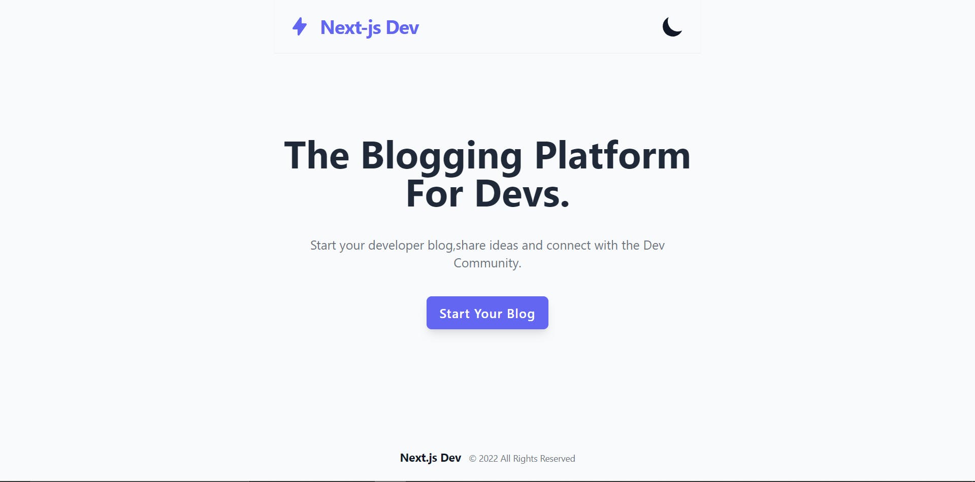
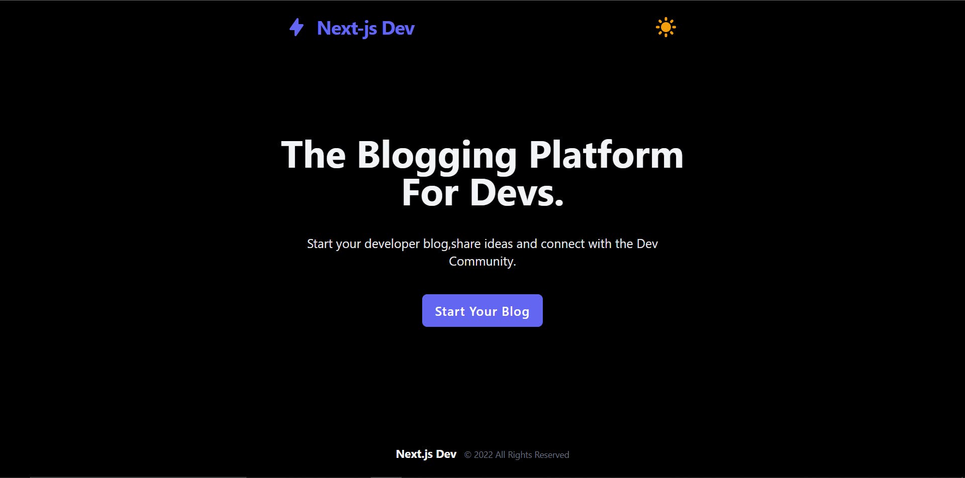
Here is the image of the website:


Tech Stack used:
- Next.js
- Tailwind CSS
- React.js
Npm Packages used:
- next-themes
- @heroicons/react
Here is a little demo of the project, that we are going to build and the GitHub link of the project also.
Step-1 Create Nextjs App and add Tailwind CSS.
First of all, create a Next.js project and add Tailwind CSS in it or you can create a new Next.js App with Tailwind CSS added in it already using this command.
    npx create-next-app my-project // without Tailwind CSS installed
    or
    npx create-next-app -e with-tailwindcss my-project //with Tailwind CSS
Now you have to install two packages next-themes and @heroicons/react from npm.
npm install next-themes @heroicons/react
Step-2 Creating Navbar and Hero Section.
Let's create a simple Navbar, with a Hero section so that we can look at the changes of dark mode and light mode themes.
So, first of all, create two folders named components and sections in the root of the directory.
Inside the components, create a file name Logo.js and paste this code inside that.
Inside Logo.js write this code:
    import { LightningBoltIcon } from "@heroicons/react/solid";
    import Link from "next/link";

    const Logo = () => {
        return (
            <Link href="/">
            <a className="my-2 flex items-center space-x-1 text-indigo-500">
              <LightningBoltIcon  className="h-8 w-8 flex-shrink-0 mr-3"/>
              <span className="font-bold text-3xl font-sans tracking-tight whitespace-nowrap">Next-js Dev</span>
            </a>
            </Link>
        )
    }

    export default Logo;
Then create three files inside the section folder.
- Header.js
- Layout.js
- Footer.js
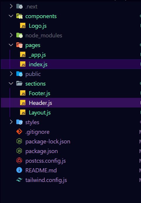
The file structure will look like this:

Inside the Header.js write this code:
import Logo from "../components/Logo";

    const Header = () => {

      return (
        <header className="h-15 shadow-sm dark:border-gray-700">
          <div className="container  px-4 sm:px-6 py-4 flex justify-between items-center">
            {/* Logo */}
            <Logo />
          </div>
        </header>
      );
    };

    export default Header;
Inside the Footer.js write this code:
const Footer = () => {
return (
<footer className="px-4 sm:px-6 py-6 mt-24">
<div className="text-center text-sm text-gray-500">
<span className="dark:text-gray-100 text-gray-900 font-bold text-lg mr-2"> Next.js Dev</span> © {new Date().getFullYear()} All Rights Reserved
</div>
</footer>
);
};
export default Footer;
Inside the Layout.js write this code:
import Header from "./Header";
import Footer from "./Footer";
import Head from "next/head";

    const Layout = ({ children}) => {
      return (
        <>
          <Head>
            <title>Nextjs-Dev Blog</title>
            <link rel="icon" href="/favicon.ico" />

          </Head>

          <div className="min-h-screen mx-auto max-w-2xl flex flex-col">
            <Header />
            <main className="flex-grow container mx-auto px-4 sm:px-6">
              {children}
            </main>
            <Footer />
          </div>
        </>
      );
    };

    export default Layout;
Step-3 Importing the ThemeProvider from next-themes.
Now, open the _app.js inside the pages folder and write the following code given below.
Inside _app.js file:
import "tailwindcss/tailwind.css";
import "../styles/globals.css";
import { ThemeProvider } from "next-themes";

    function MyApp({ Component, pageProps }) {
      return (
        <ThemeProvider enableSystem={true} attribute="class">
          <Component {...pageProps} />
        </ThemeProvider>
      );
    }

    export default MyApp;
After that open the tailwind.config.js file and then add a property darkMode in it and give a value "class" to it like this.
module.exports = {
      mode: "jit",
      purge: [
        "./pages/**/*.{js,ts,jsx,tsx}",
        "./components/**/*.{js,ts,jsx,tsx}",
        "./sections/**/*.{js,ts,jsx,tsx}",
      ],
      darkMode: "class",
      theme: {
        extend: {
        },
      },
      variants: {
        extend: {},
      },
      plugins: [],
    };
Now, whenever, the dark class is present earlier in the HTML tree, tailwind CSS will apply the dark styles, otherwise, it applies the light theme by default.
Step-4 Adding a toggle button to control dark mode manually.
Now let's add the ability to toggle the dark mode manually from the user interface.
Open the `Header.js` file from the `sections` folder, and import the `useTheme` hook from `next-themes`, along with the `MoonIcon` and the `SunIcon` components from heroicons.
Then, retrieve the `systemTheme`, the `theme`, and the `setTheme` properties by calling `useTheme` at the top of your component.
From there, create a new method names `renderThemeChanger` and get the current theme from the system or the `theme` variable.
Now, if the current theme is dark, we return the `SunIcon` component and implement the `onClick` event by using the `setTheme` method from `next-themes` to toggle the theme back to light on click to this icon.
Otherwise, we return the `MoonIcon` component and set the theme to dark on click.
Finally, we can call this new method right inside our JSX to render the current theme icon, and align it with our logo with flexbox.
The Header.js file now looks like this:
import Logo from "../components/Logo";
import {useTheme} from "next-themes";
import{SunIcon ,MoonIcon} from "@heroicons/react/solid";

    const Header = () => {

      const {systemTheme , theme, setTheme} = useTheme ();

      const renderThemeChanger= () => {

          const currentTheme = theme === "system" ? systemTheme : theme ;

          if(currentTheme ==="dark"){
            return (
              <SunIcon className="w-10 h-10 text-yellow-500 " role="button" onClick={() => setTheme('light')} />
            )
          }

          else {
            return (
              <MoonIcon className="w-10 h-10 text-gray-900 " role="button" onClick={() => setTheme('dark')} />
            )
          }
       };

      return (
        <header className="h-15 shadow-sm dark:border-gray-700">
          <div className="container  px-4 sm:px-6 py-4 flex justify-between items-center">
            {/* Logo */}
            <Logo />

            {renderThemeChanger()}
          </div>
        </header>
      );
    };

    export default Header;
Step-5 To avoid hydration mismatch.
There is one more thing we need to do to avoid hydration mismatch.
Because we cannot know the theme on the server, the values returned from useTheme will be undefined until mounted on the client.
In other words, our theme icon will not match the actual current theme. And that's pretty bad for user experience.
So to fix this, we need to make sure we only render our icon when the page is mounted on the client.
So, import the useState and useEffect hooks from react.And create a new state variable to track if the component has been mounted or not on the client-side.
Set the initial value to false, and then set its value to true inside a useEffect hook.
Finally, inside the renderThemeChanger, check if the component is mounted before rendering the UI for the theme changer.
Inside Header.js file:
import {useState, useEffect} from "react";

    const Header = () => {
    const [mounted, setMounted] = useState(false);

      useEffect(() =>{
        setMounted(true);
      },[])

    const renderThemeChanger= () => {
          if(!mounted) return null;

          const currentTheme = theme === "system" ? systemTheme : theme ;

          if(currentTheme ==="dark"){
            return (
              <SunIcon className="w-10 h-10 text-yellow-500 " role="button" onClick={() => setTheme('light')} />
            )
          }

          else {
            return (
              <MoonIcon className="w-10 h-10 text-gray-900 " role="button" onClick={() => setTheme('dark')} />
            )
          }
       };
    }
Step-6 Time to add Dark Mode variant styles.
Now that everything is all set, let's add the styles to our elements using the `dark` variant from Tailwind CSS, save your file and refresh your browser.
Now navigate to the styles folder and open the global.css file.
Inside global.css that paste this code:
    @tailwind base;
    @tailwind components;
    @tailwind utilities;

    @layer base {
      body {
        @apply bg-gray-50 text-gray-900 dark:bg-black dark:text-gray-100;
        @apply min-h-screen;
      }

      ::selection {
        @apply text-white bg-indigo-500;
      }


      .btn{
        @apply inline-block px-5 py-3 rounded-lg hover:bg-indigo-600 transition duration-300 shadow-lg bg-indigo-500 text-white capitalize tracking-wider font-semibold text-sm sm:text-xl focus:outline-none focus:ring-4 focus:ring-indigo-500 focus:ring-opacity-50 whitespace-nowrap
      }
    }
You can now change the theme of your application manually from
the UI which is what we wanted.
You can easily change those dark variants by just adding classes like this:
<h1 className=" dark:bg-gray-900 dark:text-gray-100 " >This is H1 heading</h1>
Conclusion
So that was all about adding Dark mode in Nextjs App using Tailwind CSS. I hope you like this and enjoyed building this project.
If you think that this was helpful and then please do consider visiting my original blog link and do follow me on Twitter and connect with me on LinkedIn.
If you were stuck somewhere and not able to find the solution you can check out my completed github repository here.
Thanks for your time to read this project, if you like this please share it on Twitter and Facebook or any other social media and tag me there.
Some Useful Link:
Connect with me:
